——Why a Well-Designed UX Can Double Your SaaS Conversion Rate ?
In today’s fast-paced digital landscape, businesses are under constant pressure to deliver exceptional user experiences while scaling efficiently. For startups and small businesses competing in tight markets, having a strong online presence is crucial for attracting and retaining customers. One of the most critical elements of this strategy is ensuring that your SaaS platform provides an intuitive and seamless user experience.
A well-designed UX fundamentally transforms how users interact with your product. It ensures that people can accomplish their goals with minimal friction, which drives higher satisfaction, loyalty, and repeat purchases. Conversely, a poor UX amplifies user-exit behavior—abandonment at the very moments that matter (sign-up, onboarding, checkout, upgrade). If you’ve ever watched a stellar product lose prospects at the first hurdle, you know why UX deserves a front-row seat in your growth strategy.
Introduction
Across the SaaS lifecycle—from discovery to onboarding to renewal—UX is the connective tissue that determines whether users progress or drop off. The difference between “almost converting” and “converting consistently” often comes down to clarity, speed, trust, and the removal of micro-frictions. This article shows why UX is the lever most likely to move your conversion rate and how to build a practical, evidence-driven plan to improve it.
1. Current UX Challenges
Many SaaS teams recognize that conversion is not a single moment; it’s a chain of tiny yeses: click ad → skim landing page → start trial → complete sign-up → experience first value → return tomorrow → choose paid. Weakness at any link snaps the chain. Common problems include:
- Cognitive overload on landing pages. Walls of text, vague headlines, or unclear CTAs force users to think too hard before taking the next step.
- Ambiguous value propositions. “All-in-one platform” doesn’t tell buyers what you fix or how you’re different.
- Friction in the sign-up flow. Mandatory phone numbers, email verification dead-ends, or password requirements before perceived value often create early exits.
- Onboarding without a “first win.” Users who don’t experience value in the first session rarely return.
- Pricing confusion. Poor plan naming, hidden fees, or missing annual savings make buyers hesitate at checkout.
- Trust gaps. Absent social proof, security assurances, or transparent policies can quietly depress conversions.
- Performance issues. Slow pages or janky interactions compound every other problem.
Industry research consistently shows that friction compounds drop-off, especially in the first minutes of a session. You don’t need a universal percentage to act; you need to find your product’s highest-leverage friction points and remove them deliberately.
The Road to a Better User Experience
Improving UX is not a one-off redesign—it’s a system:
- User Research: Interview target users, observe tasks, and map their jobs-to-be-done. Pair qualitative methods (interviews, usability tests) with quantitative data (funnel analytics, heatmaps, session replays).
- Simplicity: Prioritize clarity over cleverness. Use plain language and progressive disclosure to reveal complexity only when needed.
- Consistency: A unified design system reduces user effort. Consistent components, spacing, and states make flows predictable.
- Accessibility: Inclusive design (semantic HTML, keyboard nav, contrast, ARIA where appropriate) expands your market and improves usability for everyone.
- Performance: Optimize for speed; latency is conversion tax.
- Feedback Loops: Instrument the product, test hypotheses (A/B), and keep shipping small, measurable improvements.

2. Implementation Recommendations
To maximize the impact of your UX work:
- Conduct User Testing: Observe 5–8 target users attempting key tasks. Look for hesitations and verbalized confusion; those moments are your roadmap.
- Adopt Agile, Incremental Sprints: Ship weekly. Each release should reduce friction or increase clarity for a specific step in the funnel.
- Leverage Data-Driven Decisions: Define a metric tree (e.g., Trial → Activation → Day-7 Retention → Trial-to-Paid). Instrument events. Abandonment tells you where; user feedback tells you why.
- Prototype First: Validate the concept with clickable prototypes before engineering investment.
- Close the Loop: After shipping, compare old vs. new with proper baselines and sample sizes. Keep what works; roll back what doesn’t.
What “Doubling Conversion” Actually Means (and How UX Drives It)
“Double” can look different depending on the stage:
- Visitor-to-Lead (or Trial): Improve landing clarity, relevance, and perceived safety to lift CTA clicks and trial starts.
- Lead-to-Activated: Fast-track users to an aha moment (e.g., “share your first doc,” “sync your first source,” “invite a teammate”).
- Activated-to-Paid: Tie pricing to value moments, reduce checkout friction, and surface ROI stories in-app.
- Upgrade and Expansion: Use in-product nudges at the right moments (usage thresholds, feature locks, collaboration prompts).
- Renewal: Clear value reporting and proactive risk detection reduce churn, which—mathematically—lifts effective conversion on future cohorts.
Because conversion is multiplicative across steps, a series of modest UX lifts (e.g., +15% at landing, +20% at activation, +10% at checkout) can produce “2×” overall.
High-Leverage Surfaces to Audit First
1) Landing Pages (Acquisition)
- Hero formula: Who it’s for + core outcome + specific differentiator + primary CTA.
- Above-the-fold proof: 3–5 recognizable logos, a short testimonial, and security/availability badges.
- Skimmable structure: Benefit-led subheads, short paragraphs, bullets, and product visuals that show the outcome (not just UI chrome).
- Message-market fit: Align ad copy and keywords with the first words users see—no bait-and-switch.
2) Sign-Up & Onboarding
- Reduce fields: Ask for essentials only; defer the rest (“progressive profiling”).
- SSO/Passkeys: Offer low-friction authentication options.
- Guided first session: A 2–3 step checklist leading to the first aha moment. Celebrate completion with micro-rewards.
- Empty-state design: Seed screens with examples and guided actions so users aren’t staring at a blank app.
3) Trial-to-Paid & Pricing
- Plan naming for comprehension: Names that map to audience segments or usage tiers.
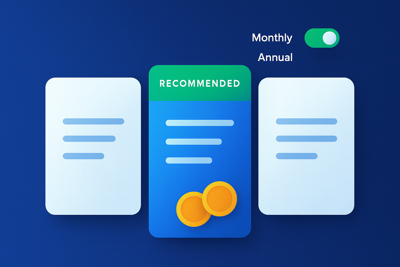
- Value-based comparison: Use a “recommended” plan and highlight feature differences users actually care about.
- Transparent pricing: Clear monthly vs. annual savings and no hidden fees.
- Contextual upgrade prompts: In-app when the user hits a limit or tries a premium feature.
4) Checkout & Billing
- Trust signals: PCI, secure payments, refund/guarantee, and clear cancellation.
- Inline validation: Real-time, specific error messages.
- Autofill + wallet options: Reduce clicks and typos.
5) Cancellation & Win-Back
- Save offers based on reason: Downgrades, pause plans, or guided help.
- Exit survey: Small, single-question with optional details to fuel roadmap decisions.
- Post-cancel lifecycle: Non-spammy win-back triggered by new features or use-case fit.

3. Design Principles That Move Numbers
- Clarity Before Cleverness: Replace abstract slogans with concrete outcomes (“Close your books 5× faster” beats “Reimagine finance”).
- Progressive Disclosure: Show the next best action; hide advanced settings until needed.
- Choice Architecture: Default to the plan most buyers choose; keep secondary options discoverable.
- Cognitive Load Management: Use whitespace, chunking, and visual hierarchy.
- Error Prevention & Recovery: Prevent mistakes (disabled actions, confirmations) and make recovery easy (undo, draft autosave).
- Jakob’s Law: Follow common patterns for nav, forms, and table actions—familiarity converts.
- Fitts’ & Hick’s Laws: Make primary actions large and reduce unnecessary choices at critical moments.
4. Research & Analytics Toolkit (Practical Setup)
- Qualitative: 5–8 user interviews per segment, monthly usability tests on top flows, and lightweight intercept surveys (e.g., “What were you trying to do today?”).
- Quantitative: Funnel events: Visited LP → Clicked CTA → Started Signup → Completed Signup → Completed Onboarding Step 1/2/3 → Activated → Viewed Pricing → Started Checkout → Completed Purchase. Retention: Day-1/7/30 return rates; cohort analysis by acquisition channel. Activation: Define 1–3 actions strongly correlated with retention (e.g., “connected a data source,” “invited a teammate”).
- Session Understanding: Heatmaps and session replays to spot rage clicks, dead zones, and scroll drop-offs.
- Experimentation: A/B testing with pre-registered hypotheses, clear success metrics, and guardrails (e.g., error rate, performance).
5. A 30/60/90-Day UX Conversion Plan
Days 1–30: Audit & Quick Wins
- Map the entire funnel and compute baseline conversion at each step.
- Identify top 5 friction points using data + user tests.
- Ship low-risk improvements: clearer hero copy, simplified forms, better empty-states, and faster page loads.
- Set up dashboards for trial starts, activation, and trial-to-paid.
Days 31–60: First-Principles Improvements
- Redesign onboarding around one clear aha moment with a guided checklist and tooltips only where necessary.
- Introduce SSO/passkeys and progressive profiling.
- Rebuild pricing comparison for comprehension and transparency; add contextual upgrade prompts.
Days 61–90: Scale & Systematize
- Build or refine a design system (tokens, components, accessibility rules).
- Establish an experiment cadence (1–2 tests per week) and a research rhythm (monthly interviews + quarterly surveys).
- Implement cancellation reasons, save flows, and win-back triggers.
- Publish a UX roadmap tied to business KPIs.
Hypothetical Case Study
A B2B analytics startup struggled with stagnant trial-to-paid conversion. Diagnosis revealed three issues: (1) users had to create an account before seeing any value, (2) onboarding demanded a full data source connection (a heavy lift) without a preview, and (3) the pricing page hid annual savings and lacked a recommended plan. The team shipped three changes in six weeks:
- Value-First Demo: A live, no-login demo dataset that let prospects explore dashboards for 60 seconds before sign-up.
- Guided Onboarding: A three-step checklist—connect a source or upload a CSV (lightweight alternative), save a dashboard, invite one teammate. Each step had inline help and example data.
- Pricing Clarified: Clear plan naming, a highlighted recommendation, visible annual savings, and in-app upgrade prompts at usage thresholds.
Outcomes: visitor-to-trial rose on landing pages, activation jumped as more users reached a first win, and trial-to-paid improved once pricing became obvious and upgrades were contextual. The compounding effect produced a meaningful lift in overall conversion without a dramatic increase in traffic spend.
UX ROI: A Simple Way to Think About Payback
While exact numbers vary, you can estimate ROI with a few inputs:
- Conversion: The lift at each funnel step (e.g., +0.5 to +2.0 percentage points can be transformative when compounded).
- ARPU / ACV: Average revenue per user or per contract.
- Churn Impact: UX that improves activation typically improves retention, raising lifetime value.
- Cost to Implement: Design + engineering + tooling.
A small lift in trial-to-paid on steady traffic often pays back months (or years) of UX investment—especially when improvements also reduce support load and increase expansion revenue.
A Practical UX Checklist (Copy/Paste Into Your Tracker)
Landing & Messaging
- Clear “who/what/outcome” hero line and specific CTA.
- Above-the-fold social proof and security badges.
- Scannable structure with benefit-led subheads and product visuals.
- Message alignment between ad/keyword and landing content.
Sign-Up & Onboarding
- Offer SSO or passkeys; minimize required fields.
- Progressive profiling for non-essential info.
- First-session checklist leading to aha moment.
- Thoughtful empty-states with templates or sample data.
Pricing & Conversion
- Transparent plan comparison; highlight a recommended plan.
- Clear monthly vs. annual pricing and savings.
- Contextual upgrade prompts tied to usage or feature gates.
- Simple checkout with inline validation and wallet options.
Trust, Performance & Accessibility
- Testimonials, case studies, and recognizable customer logos.
- Fast page loads and responsive interactions across devices.
- Keyboard navigation, contrast, semantic HTML; descriptive labels and alt text.
- Clear cancellation/return policies to reduce perceived risk.
Measurement & Learning
- Event taxonomy for the full funnel.
- Weekly experiment cadence with pre-registered hypotheses.
- Monthly usability tests and quarterly surveys.
- Post-release impact reviews and knowledge base updates.
Common Pitfalls & How to Avoid Them
- Redesigning the homepage first. Start where friction is highest in the funnel, not where stakeholders stare the most.
- Collecting data without decisions. Every metric should have an owner and an action if it moves.
- Mistaking features for outcomes. Users buy outcomes; features are just how you deliver them.
- Ignoring edge cases. Accessibility and error states aren’t edge cases when they affect real revenue.
- Over-personalization too early. Basic segmentation (role, company size, use case) beats premature 1-to-1 complexity.
Conclusion: Invest in a Seamless User Experience
Investing in a well-crafted UX is not just about delight; it is a core growth strategy. By creating intuitive, friction-free experiences tailored to your audience, you compound improvements across the entire funnel—visitor to trial, trial to activated, activated to paid, paid to loyal advocate. Start by analyzing the user journey, fix the highest-leverage frictions, and keep iterating with research and experiments. With sustained commitment, your product won’t merely look better; it will sell better.

Further Reading
- How to Optimize User Experience for Your SaaS Platform
- The Role of UX in Driving Business Success
- Our Services: UX & CRO for SaaS — Learn how we can help you reduce friction and grow conversions.


