Introduction
Traditional Chinese BaZi astrology centers around one core foundation: your Day Master, the heavenly stem assigned to the day you were born. This single element defines your personal Five Elements constitution, shaping every part of your life — from your natural personality and physical body constitution to the ups and downs of your yearly fortune, plus your unique favorable and unfavorable elements (Yong Shen, or Favorable Gods). Many people struggle to understand why they constantly face obstacles in wealth, love or health, even after rearranging their home feng shui; the root cause often lies in an unbalanced personal five-element cycle mismatched with their living environment.
In this professional guide from feng shui and BaZi master Ruoguzi, we break down how to identify your Day Master and innate five-element makeup step by step. You will learn to interpret your core character traits, spot hidden physical health weaknesses, judge the strength of your life energy, and pinpoint your personal favorable gods. Most importantly, we share targeted feng shui home adjustments tailored to your own five-element needs, so you can harmonize your personal cosmic energy with your living space, reduce bad luck, and amplify long-term prosperity and wellness.
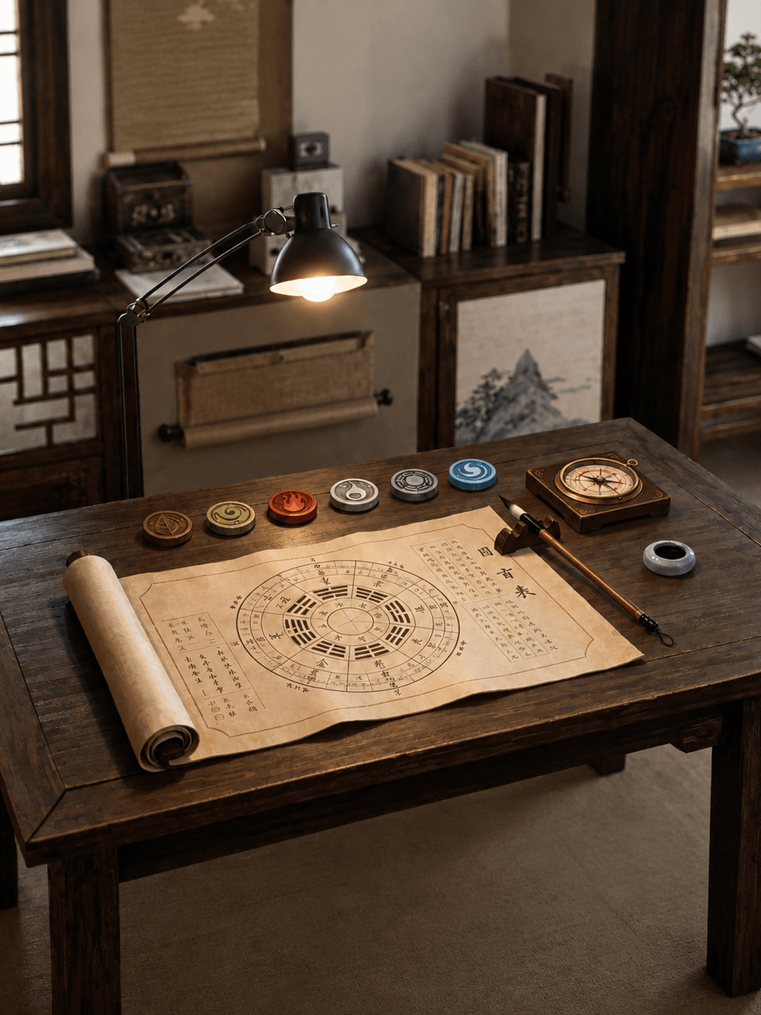
1. What Is Your Day Master & Personal Five Elements?
Your BaZi birth chart consists of four pillars of year, month, day and hour, built from Heavenly Stems and Earthly Branches. The stem sitting on your Day Pillar is your Day Master, the element that represents you as an individual. The five core elements in traditional metaphysics are Wood, Fire, Earth, Metal and Water, and every person’s Day Master falls into one of these five categories.
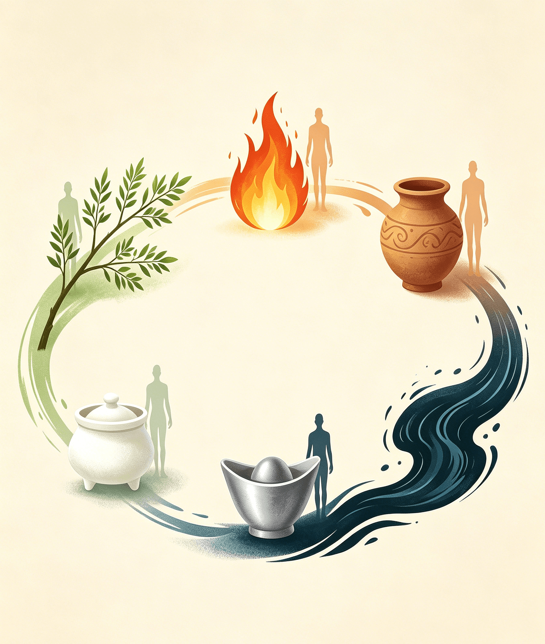
The surrounding eight characters of your birth chart create a unique mix of the five elements, forming your innate personal five-element constitution. Some people are born with overly strong Fire Day Master, others suffer from weak Wood or insufficient Water energy. This imbalance directly governs three critical life dimensions:
- Your inherent personality, thinking style and interpersonal behavior
- Your natural physical constitution, chronic health vulnerabilities and bodily energy flow
- The fluctuation of your life fortune, including career breakthroughs, wealth accumulation, and relationship harmony
From analyzing your five-element proportions, we can also calculate your Favorable Gods (Xi Yong Shen) — the elements that bring you support, opportunities and protection — as well as your Unfavorable Gods (Ji Shen), elements that drain your luck and trigger setbacks. Generic feng shui layouts only work temporarily; only remedies aligned with your Day Master and favorable gods can deliver stable, long-lasting good fortune.
2. How Your Day Master Shapes Your Personality & Physical Health
Each of the five Day Master types carries distinct character features and corresponding bodily weaknesses, which we outline clearly for quick self-judgment:

Wood Day Master
- Personality: Compassionate, creative, idealistic, persistent yet easily anxious and sensitive
- Health Risks: Liver, gallbladder, nervous system and joint discomfort
- Favorable Elements: Water (nurtures Wood) and moderate Wood; avoid excess Metal that cuts Wood
Fire Day Master
- Personality: Passionate, outgoing, bold, ambitious, prone to impatience and quick anger
- Health Risks: Heart, blood circulation, eyes, insomnia and inflammation
- Favorable Elements: Wood (feeds Fire) and mild Earth; too much Fire leads to burnout and financial loss
Earth Day Master
- Personality: Reliable, generous, responsible, practical, often overworried and slow to make decisions
- Health Risks: Spleen, stomach, digestive issues and heavy fatigue
- Favorable Elements: Fire (generates Earth) and moderate Metal; excessive Earth blocks wealth flow
Metal Day Master
- Personality: Rational, decisive, principled, strong-willed, stubborn and overly critical
- Health Risks: Lungs, respiratory tract, skin and joint pains
- Favorable Elements: Earth (nourishes Metal) and mild Water; excess Metal triggers conflict and isolation
Water Day Master
- Personality: Intelligent, adaptable, intuitive, empathetic, prone to indecision and mood swings
- Health Risks: Kidneys, urinary system, lower back and chronic fatigue
- Favorable Elements: Metal (produces Water) and gentle Wood; heavy Water washes away wealth and stability
- Master Ruoguzi reminds readers: Your physical discomfort or recurring bad luck is often a signal your personal five elements are out of balance. Before decorating your home with feng shui ornaments, confirm your Day Master and constitution first to avoid adding conflicting energy that worsens your fortunes.
3. Judge Fortune Strength & Locate Your Personal Favorable Gods
After confirming your Day Master, we analyze the quantity of supporting and restraining elements in your birth chart to judge whether your Day Master is Strong or Weak:
- Strong Day Master: Your chart holds abundant supporting elements matching your Day Master. Your Favorable Gods are the restraining elements that balance your excess energy, which will bring you career advancement and wealth growth.
- Weak Day Master: Your chart lacks elements to nourish your Day Master. Your Favorable Gods are the supportive elements that reinforce your core energy, protecting you from loss, conflict and illness.
Many feng shui enthusiasts make a common mistake: blindly placing popular lucky items such as golden money trees, red lanterns or water fountains without checking their favorable gods. For a Water-favorable person, a flowing water fountain amplifies wealth luck; yet for someone with a Fire Day Master who fears excess Water, the same fountain will trigger broken relationships and investment failures. Identifying your favorable gods is the foundational step of effective personalized feng shui.
4. Custom Feng Shui Layouts Based on Your Personal Five Elements
Once you confirm your Day Master and favorable gods, you can adjust your home’s five-element energy to match your innate needs and attract consistent good fortune:
If Your Favorable God Is Wood
- Activate East & Southeast home sectors (Wood energy zones)
- Decorate with green plants, bamboo, wooden furniture and jade ornaments
- Use soft green, teal and olive tones for curtains, bedding and wall decor
- Avoid overabundant metal decor and sharp metallic sculptures that suppress Wood energy
If Your Favorable God Is Fire
- Prioritize the South sector of your home (Fire’s core position)
- Place warm lighting, ceramic red ornaments, candles and dragon artwork
- Add red, orange and warm yellow textiles to living rooms and bedrooms
- Reduce large water features such as fish tanks or indoor water walls that extinguish Fire luck
If Your Favorable God Is Earth
- Focus on Southwest and Northeast home sectors (Earth zones)
- Display yellow crystal clusters, ceramic treasure basins and pottery art
- Decorate with beige, sand yellow and terracotta home accessories
- Limit massive flowing water decor and dark blue tones that drain Earth energy
If Your Favorable God Is Metal
- Optimize the West and Northwest home sectors (Metal energy zones)
- Add copper gourds, five emperor coins, metal statues and white crystal
- Use white, silver, cream and light grey for interior design
- Cut down excessive green plant arrangements that clash with Metal
If Your Favorable God Is Water
- Activate the North sector of your house (Water’s native position)
- Place small fish tanks, obsidian ornaments, water paintings and dark jade
- Incorporate navy blue, black and dark grey home textiles
- Avoid overcrowding the space with red fiery decor that consumes Water energy
5. Why Generic Feng Shui Fails Without Day Master Analysis
Mass-produced zodiac or yearly feng shui guides offer one-size-fits-all advice, ignoring the most critical variable: your unique personal five-element energy. Two people born under the same Dragon zodiac sign can have completely different Day Masters — one with a strong Earth Day Master needing Metal, another a weak Fire Day Master needing Wood. The same wealth-boosting layout will bring great fortune to one and financial losses to the other.
By learning your Day Master and favorable gods, you transform feng shui from superficial decoration into a customized energy harmonization system. You can target weak areas of your life: use favorable element decor to stabilize career momentum, boost income, soften romantic friction, and ease chronic physical discomfort long-term.
Conclusion
Your Day Master and innate five-element constitution are the invisible blueprint of your life, governing your character, health and fortune trajectory. Without understanding this core foundation, all feng shui adjustments risk being mismatched and ineffective. In this guide, master Ruoguzi simplifies professional BaZi five-element analysis, teaching you how to read your own birth chart, identify favorable gods, and design fully personalized home feng shui layouts to balance your cosmic energy.
Align your living space with your personal five-element needs, and you will clear away persistent life obstacles, unlock steady wealth opportunities, enjoy harmonious relationships and maintain lasting physical vitality all year round.