Introduction
Many feng shui enthusiasts only chase short-term yearly lucky remedies, constantly swapping ornaments and rearranging furniture with every new zodiac cycle, yet they still fail to achieve stable, lasting fortune. The root issue lies in relying on temporary luck adjustments rather than mastering universal, lifetime-applicable feng shui rules. Compiled by feng shui master Ruoguzi, this 2026 Lifetime Feng Shui Guide breaks free from one-year limited tricks, delivering timeless core principles that you can apply to your home, office and daily life for decades.
This complete handbook covers foundational five-element balance, permanent auspicious sector layout, long-term wealth storage feng shui, lifelong relationship harmony solutions and health-protecting space adjustments. Whether you are furnishing your first apartment, upgrading a family house or optimizing your workplace, these proven feng shui techniques work for every age and life stage, helping you stabilize positive energy flow, block persistent bad qi, and sustain steady wealth, smooth career growth and wellness for your entire lifetime.
1. Why Generic Yearly Feng Shui Tips Cannot Bring Long-Lasting Fortune
Most online feng shui content only focuses on annual flying star adjustments for a single zodiac year, ignoring the fixed, permanent energy structure of your living space. Here are three critical flaws of short-term feng shui fixes:
- Temporary ornaments only shift surface qi, failing to fix deep-rooted five-element imbalance in your house. After removing yearly lucky charms, old troubles like money leakage, workplace conflict and sleep loss will return.
- Yearly star positions change every 12 months, forcing frequent furniture rearrangement that disrupts your stable life energy rhythm.
- Generic one-size-fits-all advice does not match your personal Day Master five-element constitution, so lucky decor for others may become your persistent source of misfortune.
The core logic of lifetime feng shui, as shared by Master Ruoguzi, is to build a naturally balanced space foundation first. Once your home’s permanent energy circulation is optimized, annual minor negative stars will barely impact your fortune, and small seasonal feng shui tweaks will multiply their positive effects.
2. Foundational Lifetime Feng Shui Rules For All Residences
These universal layout standards apply to every house, apartment and office space, creating a stable auspicious energy base that lasts a lifetime:
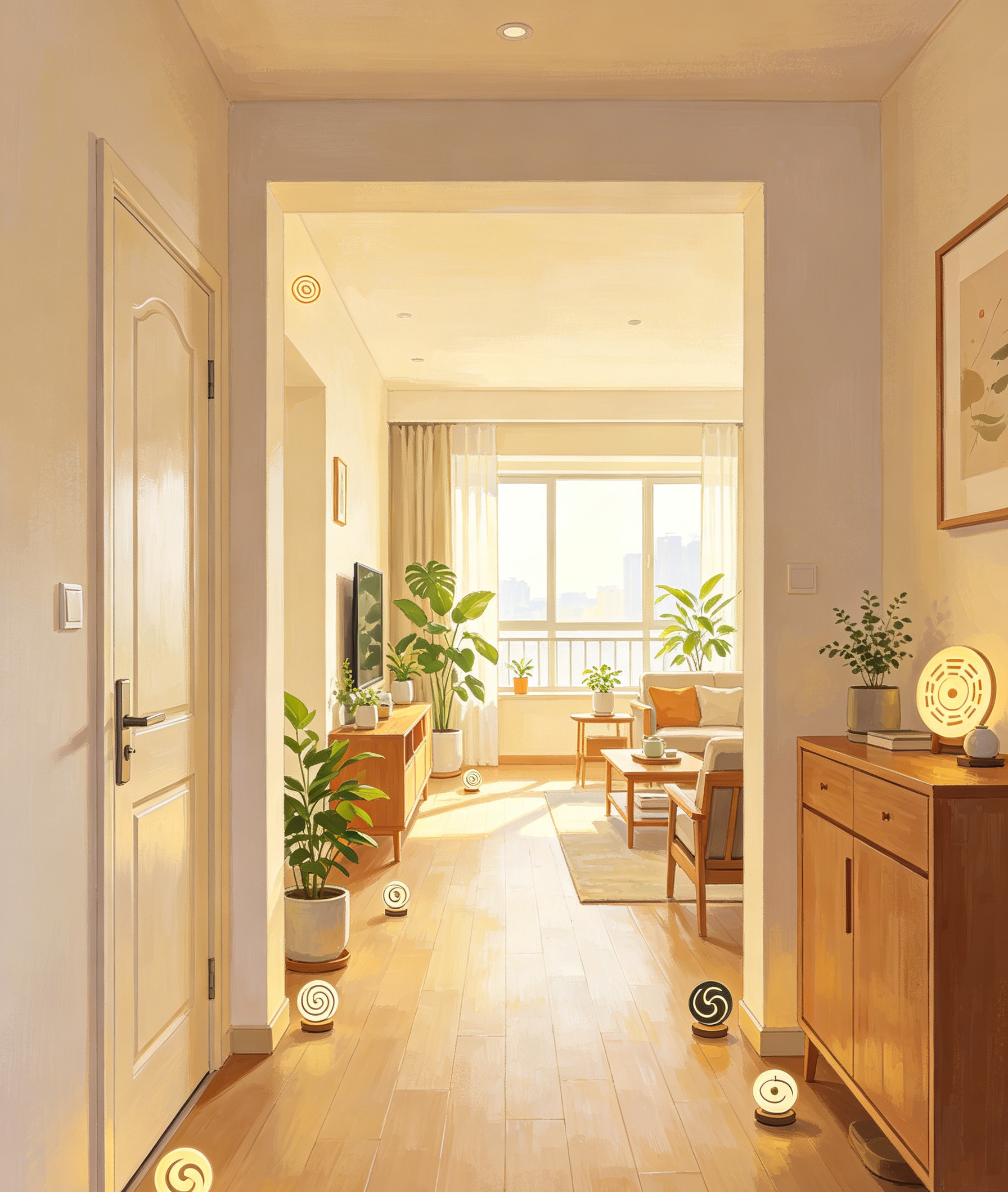
2.1 Maintain Unblocked Main Qi Circulation
Qi enters your home through the front entrance and flows through living rooms to bedrooms. Never place tall cabinets, dense screen partitions or large trash storage directly facing your front door — these barriers trap stagnant negative qi and block incoming wealth luck long-term. Keep hallways, windows and balcony passages clean, empty and well-ventilated year-round to sustain smooth positive energy circulation.
2.2 Fix Permanent Five-Element Imbalance In Core Zones
Every home holds fixed five-element sectors that never shift with annual zodiac cycles:
- East & Southeast: Wood zones (govern growth, career and youth luck)
- South: Fire zone (govern reputation, social status and family vitality)
- Southwest & Northeast: Earth zones (govern wealth storage, family health and stable income)
- West & Northwest: Metal zones (govern authority, noble people and mental clarity)
- North: Water zone (govern long-term fortune, wisdom and financial opportunities)
Long-term fortune decline always stems from over-dominant or severely deficient elements in these fixed zones. For example, a north bedroom stacked with heavy red fiery decor will continuously drain water wealth energy, triggering lifelong unstable income and anxiety. Master Ruoguzi’s guide includes simple permanent decor matching methods to balance each sector’s five-element energy once and for all.
2.3 Eliminate Permanent Sha (Negative Energy) Sources
Certain household flaws create persistent harmful sha that erodes your luck year after year, far more damaging than temporary annual malefic stars:
- Sharp-corner furniture, exposed ceiling beams pressing down above beds or desks
- Broken mirrors, cracked ceramic decor, leaking water pipes and moldy walls
- Bathroom doors directly facing dining areas or master bedrooms
- Overgrown thorny plants such as cacti placed in living or sleeping spaces
- These sha sources emit negative energy 365 days a year. The lifetime feng shui guide shares permanent resolution layouts instead of disposable temporary cures, completely removing the root of misfortune rather than just covering it up.
3. Lifetime Wealth Feng Shui: Build Permanent Wealth Storage For Long-Term Savings
Many people activate yearly wealth stars but still struggle to accumulate savings, because they lack a fixed wealth vault layout in their home. This 2026 guide introduces two lifelong wealth-preserving feng shui setups suitable for all families:
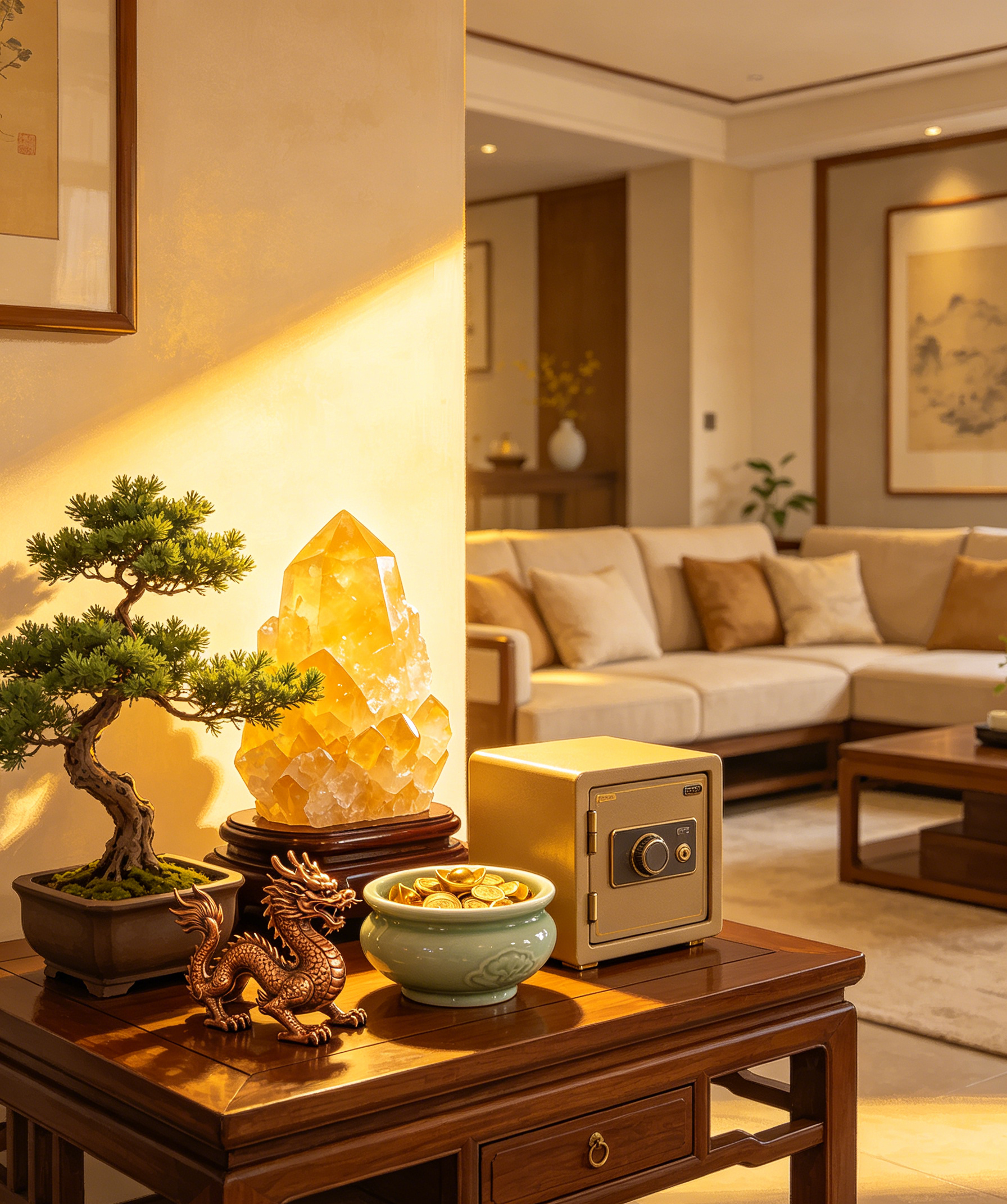
- Fixed Earth Wealth Vault (Southwest Sector)
The southwest is the permanent earth treasury, the most stable position for storing assets. Place undamaged yellow crystal clusters, solid ceramic treasure basins or a small safe here, and avoid water features or large metal decor that drain earth wealth energy. This layout steadily locks your salary, investment returns and passive income, preventing random overspending and unexpected financial losses for decades. - Long-Term Career Income Activation (Southeast Sector)
Southeast wood energy drives continuous career growth and new income sources. Keep this zone bright and filled with lush evergreen plants year-round; a copper dragon ornament placed here sustains steady promotion chances, client orders and side business profits throughout every life stage.
Critical Lifetime Wealth Taboo
Never install fish tanks, flowing water fountains or open cash storage in the northwest metal zone long-term. Excessive water restrains metal authority energy, triggering frequent business setbacks and lost investment opportunities over the years.
4. Lifelong Relationship & Health Feng Shui Adjustments
4.1 Stable Marriage & Family Harmony Feng Shui
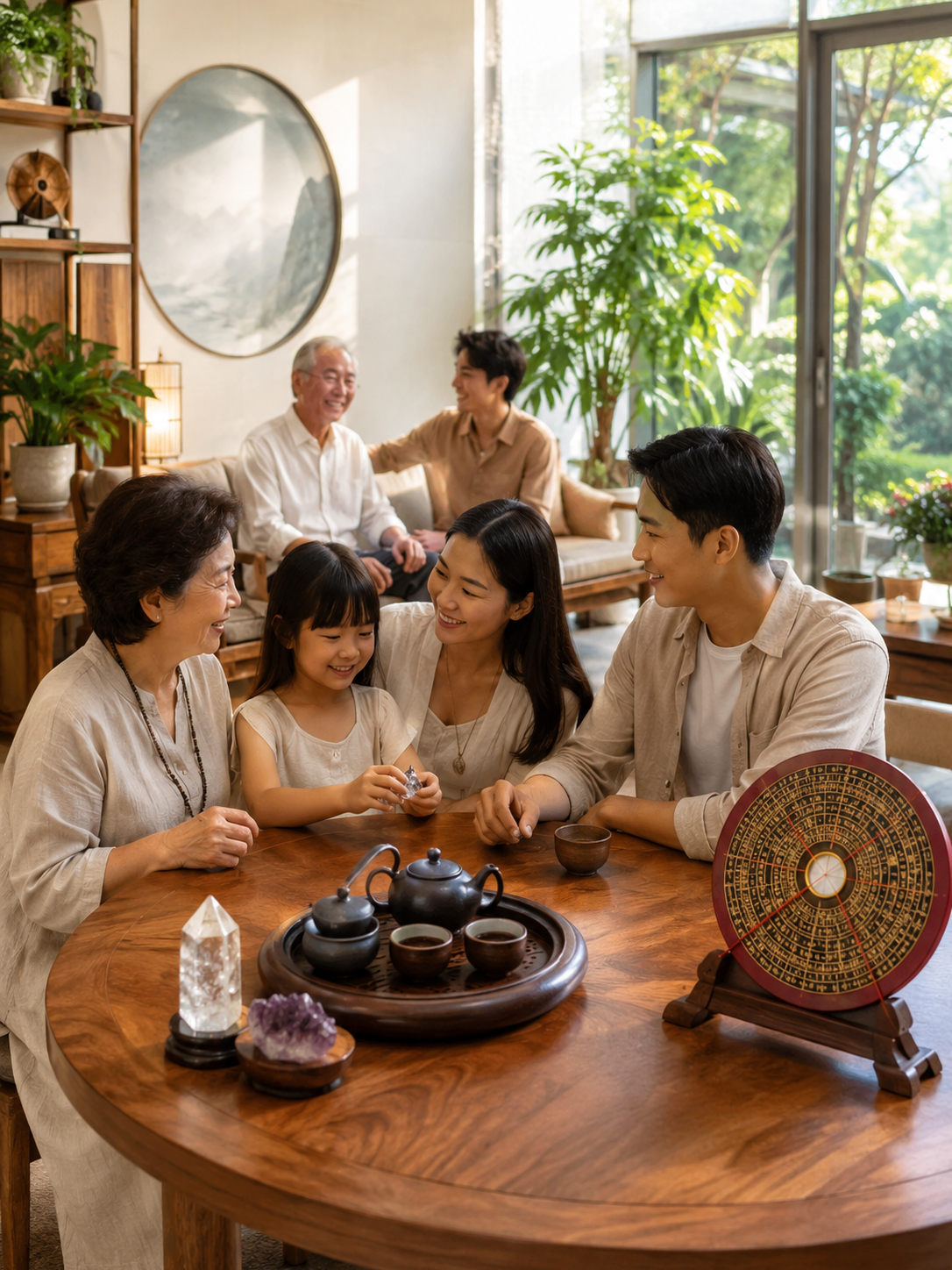
The southwest sector also governs elder family bonds and marital relations. Avoid single figurines, isolated decorative artwork or cold metallic minimalist decor here; matching pairs of dragon-phoenix ornaments, warm yellow soft furnishings and round tea tables maintain gentle harmonious qi, reducing long-term quarrels, separation tension and family rifts. For single people, a balanced southeast peach blossom wood zone delivers sincere, lasting soulmate connections instead of fleeting toxic romances across all age periods.
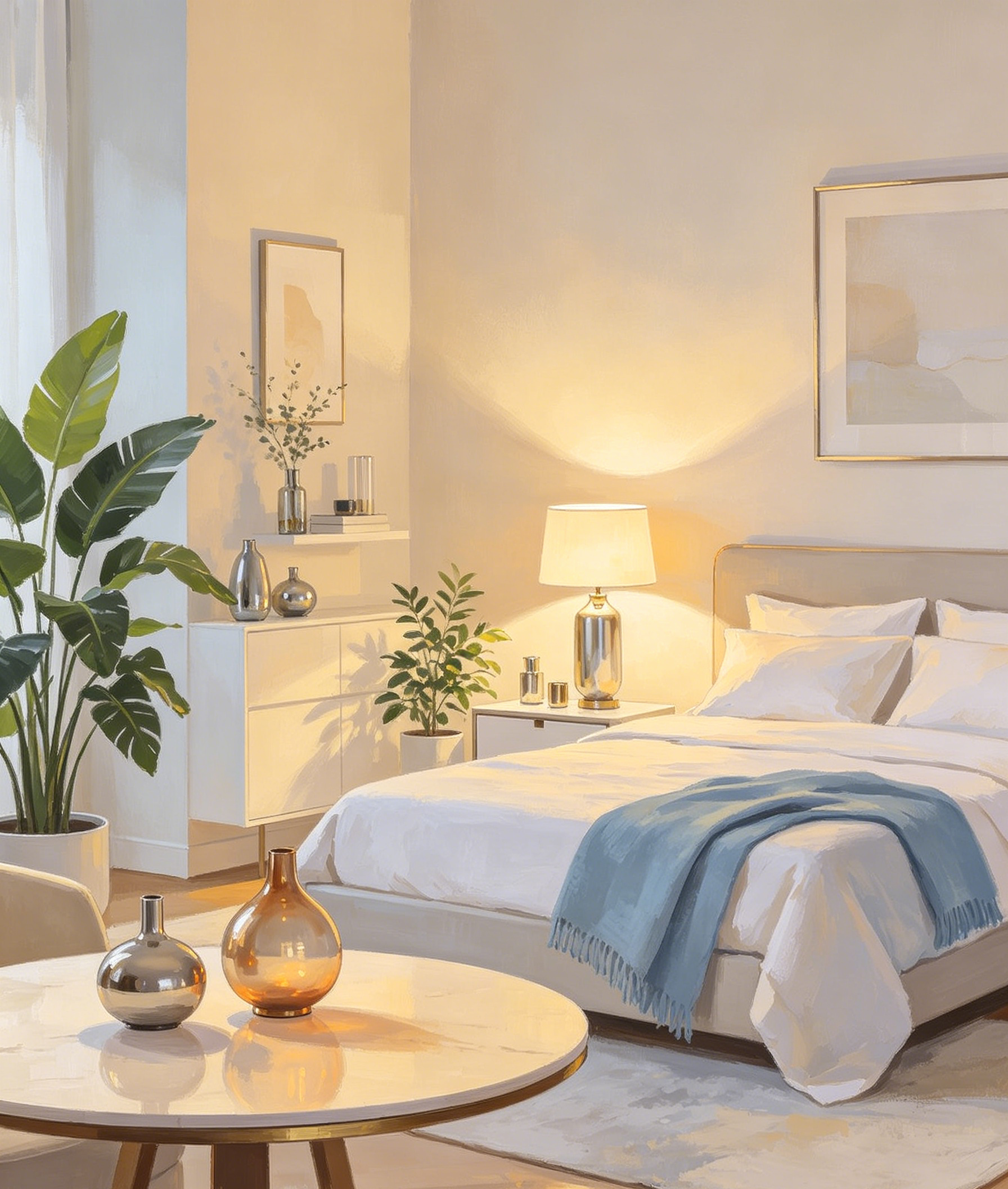
4.2 Permanent Health Protection Layout
Your bedroom’s northwest metal zone controls respiratory, cardiovascular and mental wellness for life. Add mild white and metallic decor to reinforce metal energy if your Day Master favors metal, while soft blue water textiles balance overactive fire energy to ease chronic insomnia and inflammation. Never place electrical appliances, large TV screens or red fiery murals directly above your bed — constant fire qi accumulation will gradually damage your physical condition over years.
5. How To Combine Lifetime Feng Shui With Yearly Zodiac Remedies
The biggest advantage of mastering permanent feng shui foundations is that yearly star adjustments become minor supplementary steps instead of mandatory overhauls. Take the 2026 Bingwu Fire Horse Year as an example:
- First, confirm your home’s fixed five-element sectors are balanced with the lifetime layout rules from this guide.
- Add small, temporary lucky ornaments targeting 2026’s Tai Sui and Sui Po negative stars only as minor support.
- Remove seasonal decor at the end of the year without disrupting your core permanent feng shui setup.
This two-tier system lets you absorb annual auspicious energy while retaining stable lifelong fortune support, avoiding the exhaustion of full home rearrangement every zodiac year.
6. Exclusive Long-Term Lucky Charms Recommended In The 2026 Lifetime Feng Shui Guide
These three ornaments balance five-element energy permanently and do not need yearly replacement:
- Copper Five Blessings Gourd
Absorbs persistent negative sha, stabilizes household health and locks wealth vaults, compatible with all five-element Day Master types. Place in wealth zones or beside bedroom doorways for lifelong protection. - Natural Obsidian Triple-Harmony Zodiac Pendant
Matches your personal birth sign to activate lifelong nobleman luck, blocking long-term workplace schemers and accidental mishaps during travel and daily work. - Solid Yellow Crystal Cluster
Permanently reinforces earth wealth energy in your southwest treasury zone, slowing capital outflow and steadily boosting asset accumulation over decades.
Conclusion
Most feng shui materials focus on short-term yearly fortune, ignoring the lifelong stable energy foundation of your living space. Ruoguzi’s 2026 Lifetime Practical Feng Shui Guide shifts the focus from temporary lucky tricks to universal, permanent space harmonization principles. By balancing your home’s fixed five-element sectors, eliminating persistent negative sha sources and building permanent wealth, relationship and health layouts, you can create a living environment that continuously nurtures your fortune at every life stage.
When your home’s core qi circulates harmoniously all year long, annual zodiac star fluctuations will barely disrupt your progress. Combine these timeless feng shui rules with small seasonal adjustments, and you will enjoy sustained wealth growth, smooth career advancement, harmonious family bonds and lasting physical wellness for your entire lifetime.